Maggie's FarmWe are a commune of inquiring, skeptical, politically centrist, capitalist, anglophile, traditionalist New England Yankee humans, humanoids, and animals with many interests beyond and above politics. Each of us has had a high-school education (or GED), but all had ADD so didn't pay attention very well, especially the dogs. Each one of us does "try my best to be just like I am," and none of us enjoys working for others, including for Maggie, from whom we receive neither a nickel nor a dime. Freedom from nags, cranks, government, do-gooders, control-freaks and idiots is all that we ask for. |
Our Recent Essays Behind the Front Page
Categories
QuicksearchLinks
Blog Administration |
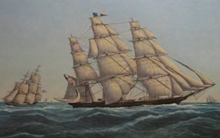
Thursday, January 20. 2011Thursday morning linksThe Maggie's Farm banner: We are experimenting with it. Comment and critique welcome. Poe visitor a no-show again De X explains Thought disorders, psychiatrically Old Urbanist: "Affordable Housing," part II Watts: AAAS withdraws “impossible” global warming paper Warmists: 'We can't win the game, so let's change the rules' Bias in the media - LA Times and Global Warming George Soros-Backed Group Demands Glenn Beck’s Firing Legal Ins: Operation Demoralize Is Working Saudi writer: Israel deserves respect Michelle: The Hate Speech Inquisition Steve King: Obamacare 'A Theft of Liberty' Britain Inundated by Pint-Sized Thought Criminals City Journal: Philanthropy and Its Enemies - Private giving must be shielded from the intrusions of Social Security is in far worse shape than you think But the Nazi Party was in favor of government medical care: Say What? Democrat Compares Republicans to Nazis
Social Security Is in Far Worse Shape Than You ThinkSee full article from DailyFinance: http://srph.it/i3dgDR
Trackbacks
Trackback specific URI for this entry
No Trackbacks
Comments
Display comments as
(Linear | Threaded)
What happened to the "We are a commune of centrist Yankees" language? It's hard to judge your font experiment without it.
I liked it better the old way, meaning the way it was a few days ago, before you started experimenting. Who moved my cheese? Back to the old logo, please. This one is so..... ordinary. Cliche, even.
Like the picture, but can you please make it twinkle like your Christmas tree?(!) I don't really care for the new lettering, sorry to be negative. It seems a bit empty and unfriendly.
I liked the old one, but if you decide to change it, I'd love to see the 'we're a commune of...' back up there, too.
Re: Changing the banner. Agree you must retain the text introducing the people of Maggie's Farm "we're a commune of . . . "
Seriously, if it ain't broke, don't fix it. Go back go back, go back to where you once belonged....
Next to the snappy, modern fonts you should put a picture of some tall skyscrapers. Maybe throw in a Verizon ad below it. Dump the blogroll in favor of catchy t-shirt banners. Stick ads between each article to really cap things off.
As Grandma said, "A job worth doing is worth doing correctly." And you're not going to argue with Grandma, are you? Grandma also said "Nothing is worth doing unless you do it right." She also had a thing for lutefisk which is the single most disgusting food on the planet right after Hobo Stew, but I don't hold that against her. :>)
Re lutefisk:
Tom, you have reminded me of a story told to me by my late brother-in-law. As you must be aware, lutefisk is some sort of delicacy for Norwegians. In the early 1900s a barrel of lutefisk arrived in a small Wisconsin town in time for Christmas. After sampling, the customer filed a claim with the railroad, asserting the lutefisk had spoiled in transit. The depot agent rejected the claim with the question, "How can you tell?' Looks like something I could do.....which is not really saying much. Keep playing!
I'm voting with the group that wants to go back to the old logo. This one is way too sterile and boring. Your blog, your call, and I'd keep reading regardless, because you've become one of my favorite places to go to lately, for reading...love the morning links..but I do hope you'll either tweak this one or go back to the old one.
Banner: I like the drop shadow, but would prefer to see it a little tighter to the letters to make the letters flatter or a little more space to give it some more depth and pop.
Font: The whole Times New Roman family of fonts is fairly common - maybe change it to something like this Stonecross or any of the variants. Fits the theme of Maggie's. Color: Don't like the color or the background in combination. Either one or the other because the shade or tone of the background and font are too similar to be effective - one is lighter (background) the other darker (the font) - the two together just don't work. Change one to something a little less neutral. If I had my druthers, I'd keep the background as it is and work on a different color combination for the font. Might want to darken up the drop shadow a touch too. The mission/site statement is a good one - I'd keep that because its so true. Maybe rework it a little to take up less space or punch it up a little. If you are really in the mood to change the banner, why not go the whole 9 yards and do something like Lilek's The Bleat with a slide show. You have enough interesting photos, participants send some in, you can change the theme from season-to-season. Top set (or bottom set) the Maggie's banner. put the mission statement off to the side - there's a ton of neat ways to spice things up if you of a mood. What I like about the The Bleat is he does a major image, then works his slide show which has a great follow through to the commentary of the day. Just some thoughts. Font? Sorry, that's Helvetica or a derivative, the one font family that truly manages to be more boring than Times (New) Roman. Helvetica was designed to have zero personality, and they succeeded beyond their wildest dreams.
If I were going to pick some standard typeface, it would be an old-style font (Caslon, Garamond, or a derivative) and get one of the speciality versions in which the letters are slightly nicked and chipped to make them look like well-worn lead type. Or a similarly customized cursive that doesn't look completely computer-generated. With warm, parchment-like background colors. Color? Minty green background? Seriously? Martha Stewart would be proud. /rant I'm not sure that i could, even with the greatest effort, more utterly mismatch a banner to what it is meant to convey. I mean, BD, you're tapping on the window of surreal. Dada. So --good joke --okay?
Old logo.... with the dogs and anglophiles and the freedoms froms .... that's all we ask.
Call's for return to old intro remind me of song about objects in the rear view mirror written by Jim Steinman.
Understandable, yall moving away from yankee commune thing but maybe yall ain't. Meself was drawn here by the name but the font is wrong and suggest color be magenta. No dah, of course Beck is antisemetic he's Mormon borg, afterall.
Thanks for the banner commentary. Sheesh. We'll work on it.
Oh dear, I knew those news stories about the Tucson shooter's use of salvia would have some worrisome consequences. I'm sure the farmers had no idea they could catch a buzz chewing or smoking salvia, and now look what's happened.
I do like the picture. I think I know the artist but am not sure enough to give you my guess. I did like the mini manifesto on the old banner better, but changing the banner isn't going to keep me away.
You gotta go back to the old header! And, besides that, as others have said....that font/size does not reflect this site at all!
Here in the middle of fly-over country I always imagine the Farm folks to live in cozy country with fishing and hunting and kids and dogs and old tractors and all sorts of interests and fancies. That stark logo just doesn't do it! The new header is a bit plain. I for one don't care for the picture either. The picture should be a slide show of the nice New England pictures you post on the site - if you are going for a NE theme. Just my two cents worth.
i agree with the others that the new england yankee rustic old-timey atmosphere comes through plain & clear and adds a root identity that would probably, if it could pull a flintlock down off the wall and proceed to Lexington Green, gladly oppose the invading modernist Sans-Serifs.
There ya go, BD --the perfect reverse-indicator just chimed in!
So Boo, thanks for the compliment.
Chiming is so much more fun when it excites prejudice and discord. "Cats" will have to do, Boo.
Though i do use more enduring term when referencing two of me favorites. Me purpose was to return yall's compliment.
#25.1.1.1.1
Leag
on
2011-01-20 15:51
(Reply)
If you must do away with the introductory "We are a commune of inquiring, skeptical, politically centrist, capitalist, anglophile, traditionalist New England Yankee humans, humanoids.." at least provide it one more time, please. It says so much about the group as a whole that I've always found charming.
BD,
You asked for a comment on the new banner so here goes. I did like the "old" one. I agree with Diane's comment re the "minty green". Maybe a change of colour. The "Maggie's Farm" seems to be shifted too far right. A little left (make the picture a little narrrower) to balance it somewhat. See how that looks. JMO. The Canuck |